Embrace the Colors of Fall: 10 Palettes for Captivating Brand Identities
As the leaves change and the air turns crisp, autumn ushers in a season of transformation. It's a time when nature dons its most vibrant and enchanting attire. If you're looking to infuse the warm and inviting spirit of fall into your brand, you've come to the right place.
In this blog post, we'll explore a collection of ten carefully curated fall color palettes made to help you start crafting your brand identity. Each palette tells a unique story, evoking emotions and associations that can elevate your brand's aesthetics and make a lasting impression on your audience.
From the cozy charm of "Cozy Cabin" to the opulent radiance of "Golden Hour," these palettes offer a wealth of creative possibilities. Whether you're rebranding, launching a new business, or simply seeking inspiration to refresh your visual identity, these fall color palettes are a valuable resource.
So, let's dive into the rich tapestry of autumn colors and discover the palette that resonates with your brand's essence.
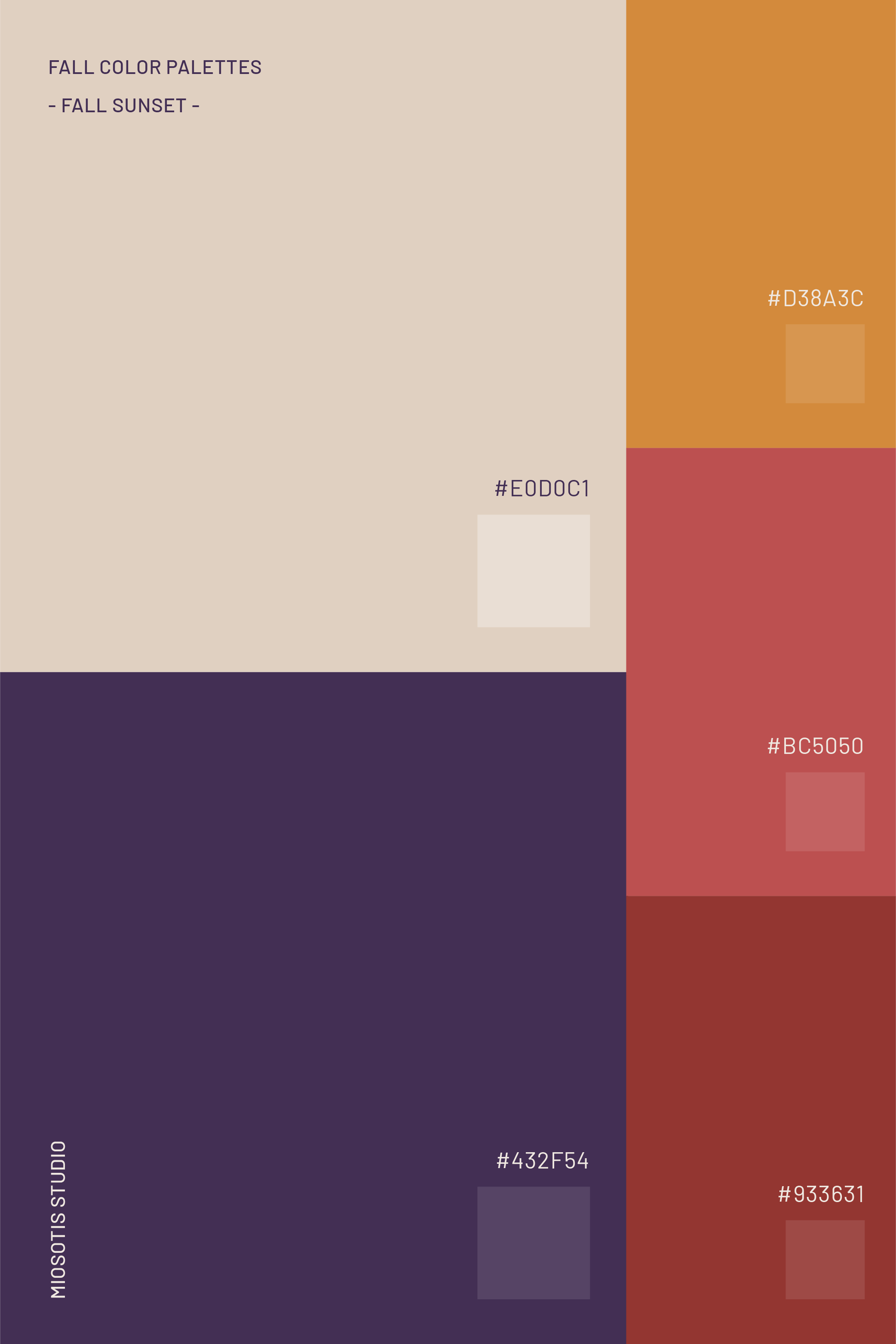
1. Fall Sunset
Fall Sunset is a captivating palette that's perfect for dynamic and energetic brands. It exudes the warm, romantic glow of a setting sun on a crisp autumn day. With colors like burnt orange, rosy pink, golden yellow, dusky purple, and deep red, this palette brings to mind the enchanting beauty of a fall sunset, making it an ideal choice for brands seeking to capture the essence of autumn in their designs.

2. Falling Leaves:
Falling Leaves is a color scheme that would perfectly complement artisans, craft stores, and jewelry brands. It captures the nostalgic and beautiful essence of autumn foliage that gently falls to the ground, evoking feelings of warmth and comfort. The palette includes hues like rusty orange, cream, cognac, brown, green, and light brown, which perfectly encapsulate the natural splendor of the fall season.

3. Cozy Cabin:
If you're in hospitality, selling cozy home goods, or running a traditional coffee shop, you might want to consider the Cozy Cabin palette. This color scheme brings to mind the warmth, comfort, and rustic charm of a log cabin in the woods. With deep and light browns, muted orange, and cozy beige, it creates a welcoming atmosphere that's perfect for a snug cabin retreat.

4. Apple Orchard:
Apple Orchard is a good choice for catering businesses and artisanal food brands. It brings to life the joy of apple picking. With colors like apple red, fresh greens, and crisp blue, this palette captures the essence of orchard-fresh delights.

5. Sweater Weather:
For architects or interior designers, Sweater Weather offers a sense of coziness, comfort, and relaxed fall style. Soft beige, heather gray, light camel, chestnut, umber, and deep orange come together to create an inviting atmosphere perfect for chilly autumn days.

6. Spiced Cider:
If your company's core business is providing hospitality services, managing winter rental properties, or even a cozy clothing brand, Spiced Cider could be an excellent option. It envelops you in the warmth and nostalgia of a comforting cup of cider. Deep cinnamon, warm caramel, dark apple red, orange zest, and soft cream make this palette a deliciously inviting option.

7. Mystic Forest:
Mystic Forest is a palette suited for clothing brands and any serious, powerful yet feminine venture. It transports you to the deep, mysterious shades of an enchanted fall forest. With colors like deep green, dusky teal, dusty berries, chestnut, and dark plum, it exudes a sense of nature's magic.

8. Golden Hour:
Golden Hour captures the opulence and warmth of autumn's golden light. Rich gold, burnt sienna, sand, and dark brown create a palette that radiates sophistication and energy.

9. Candlelit Coziness:
For nutritionists and cozy restaurants, this palette creates an illuminated and inviting ambiance. Redwood, light amber, soft khaki, taupe, and velvety green combine to set the mood for an inviting atmosphere.

10. Cornucopia:
Suited for organic food products, farmers' markets, and sustainable agriculture, Cornucopia represents the abundance and wholesome goodness of the fall harvest. Rich brown, pumpkin orange, earthy green, and deep red come together to create a palette that celebrates the bounty of the season.
It's time to say goodbye to our journey through the beautiful autumn color palettes! We really hope you enjoyed it and found some inspiration for your brand identity design. Don't forget, that choosing the right colors can be a powerful way to showcase your brand's personality and connect with your audience.
If you're looking for help to bring your brand identity to life, or if you have any questions about the color palettes we've explored, we are here for you. We specialize in crafting brand identities that not only capture your unique values and goals but also resonate with your audience. Don't hesitate to reach out!